You only get one chance for a first impression. If that's true, then the entryway of your home sets the tone for the whole house.
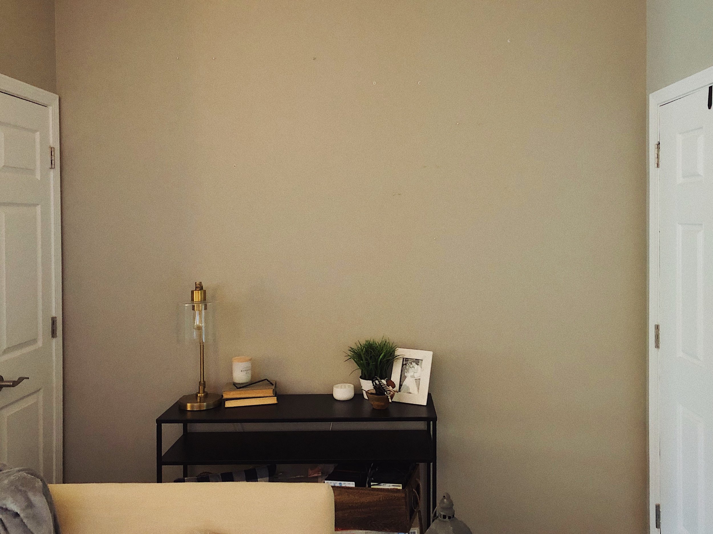
When we moved into our home, we didn't have any real plan for what we wanted to do with our entryway. It was kind of an odd space. It's really just a wall and a small coat closet tucked into the corner of our main living area. It didn’t have a defined space of its own and we also didn't have the cash (or energy) to do anything new with it. So, we repurposed a lot of artwork and decor we already had and made it a gallery wall.
Our home’s entryway when we bought the house. Literally can’t get any plainer.
I don't really want to get into the topic of gallery walls (are they dead or not?) in this post, but it became clear the longer we were in the house that our rustic gallery wall just wasn't our current style anymore. More importantly, though, it wasn't making the impression we wanted. It didn’t feel like an intentional entry point to welcome people into our home.
Our gallery wall phase. I really think we just didn’t want a massive empty wall when you first walk in, so we just threw everything we had up.
We had talked about wanting to redo the space several times but didn't have any real aim or goal in mind, so we kept putting it off. On a whim one night while Elle was at work, I took everything off the wall and decided to look at it with fresh eyes.
““The entryway of your home sets the tone for the whole house.””
I'd always wanted to do floor-to-ceiling trimwork and looking at it, this seemed like the perfect place to try it (Take a look at our building process).
The space after stripping everything off the wall.
Next, we had to decide on a color. We could play it safe and go white, but that didn't feel like the right move here. We already had white trimwork surrounding the fireplace on the opposite wall and we wanted to do something different – even unexpected. I love what bold, dark colors can do in a small space. It's counter-intuitive, but a dark color can almost make the limits of the space seem to disappear, causing it to feel larger. The color we landed on is Mount Etna by Sherwin-Williams and it wound up being perfect. It’s a deep teal that’s not too blue, and it plays well with the warm hues in the paint throughout the rest of our living area (that color is Mindful Gray by Sherwin-Williams).
We also decided to go ahead and update our door frames (blog post with a tutorial coming soon) and paint the front door. Those were both relatively inexpensive, easy upgrades that were already on our list of projects to tackle this year. We’d love to eventually replace the front door, but this was a good fix for now.
We mixed various pieces we already had on hand to style the table
To outfit the space, we knew we wanted to use mirrors to lighten things up and make the room feel bigger. Elle found these awesome mirrors on sale at Pottery Barn. They have an old-world vibe and the gold frames and chains are the perfect contrast to the deep teal paint color. We rounded out the wall with a swing-arm sconce from West Elm/Rejuvenation that we got for a steal at the West Elm outlet here in Asheville. The sconce not only saved space on our small entryway table, but also added a modern industrial element that ties in the clean lines of the metal table we reused from Target. We styled the table with some antique books (from Goodwill) that we already had, a candle, a small bowl for keys, and a tall vase and stems that we temporarily stole from our master bedroom until we can replace them. I always love incorporating greenery because it brings a natural element that softens any space, especially a bold, modern space like this one.
The finished space
One thing to note here: nothing except the trimwork on the wall is symmetrical. Don’t be afraid of asymmetry. The goal in good design is balance, not symmetry. If it helps, when you’re trying to visually balance a space, take a step back and squint. Does it feel lopsided? If so, it’s probably not balanced. There may be too much visual weight clustered in one small area.
““The goal in good design is balance, not symmetry.””
Overall, we’re really happy with the end result of this quick project! It’s much more polished, but also warm and inviting. It’s modern with a touch of industrial, yet somehow soft. And it’s unreal how much bigger our entryway feels. We finally have a defined entryway that makes our guests feel like there’s an intentional space for them to enter our home and we hope it makes them feel welcome for years to come!


